The Fordham University Department of Visual Arts is pleased to announce the release of the 2021 Adjunct Faculty Spotlightcatalog on our gallery imprint, Hayden’s Books.
The Department of Visual Arts is fortunate to have so many exceptionally talented Adjunct Professors teaching our students; in fact, we have so many skilled Adjuncts that we had to divide the Spotlight exhibition into two parts during the fall semester. Now, both exhibition installments have been brought together in a single 156-page volume providing a sampling of projects and texts representing each artist/professor.
In both their individual practice and collectively, one can discern a rigorous investigation into visual communication strategies, a spectrum of subjects, and a diverse range of representational methods. Further, this catalog provides an accurate snapshot of the Visual Arts Department, highlighting the breadth of disciplines offered, including film, graphic design, painting, and photography.
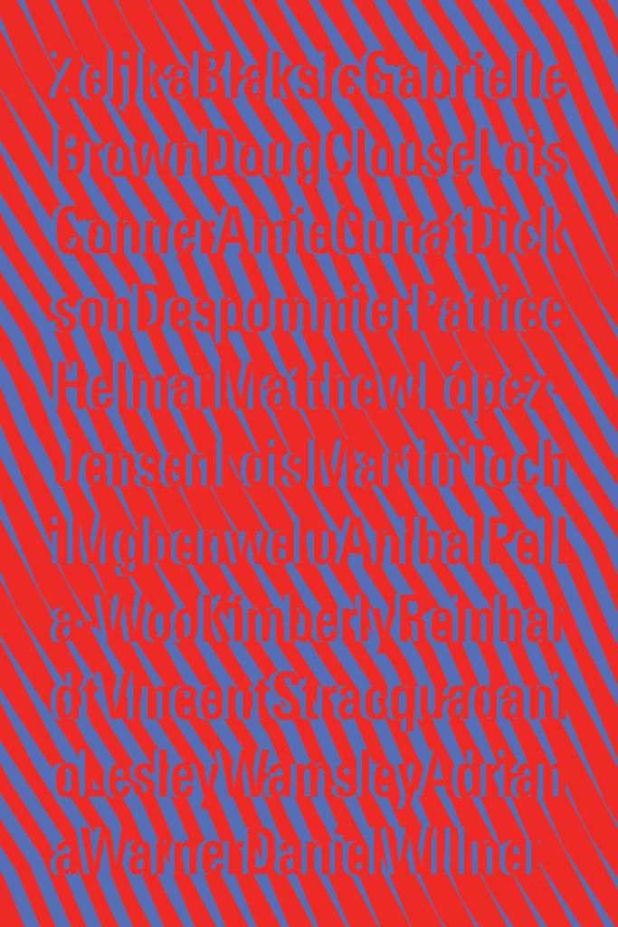
The 2021 Adjunct Faculty Spotlight catalog makes manifestly clear that our professors are vital artists as well as outstanding educators in the classroom. The catalog features the following artists: Željka Blakšic, Gabe Brown, Doug Clouse, Lois Conner, Amie Cunat, Dickson Despommier, Patrice Helmar, Matthew López-Jensen, Lois Martin, Anibal Pella- Woo, Kimberly Reinhardt, Vincent Stracquadanio, tochihannah, Lesley Wamsley, Adriana Warner, and Dan Willner.
Organized by Stephan Apicella-Hitchcock Installation: Wilson Duggan
New Exhibition: Adjunct Faculty Spotlight Part Two ?>
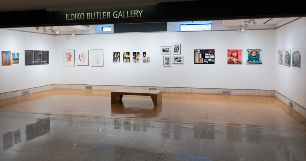
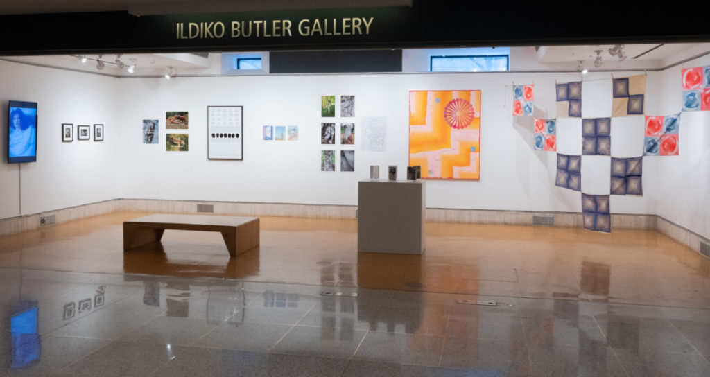
The Department of Visual Arts at Fordham University is pleased to present the 2021 Adjunct Faculty Spotlight exhibition in the Ildiko Butler Gallery. We are fortunate to have so many exceptionally talented Adjunct Professors teaching in our department, in fact, so many that we have had to divide this exhibition into two parts.
Gabe Brown, Lois Conner, Dickson Despommier, Lois Martin, TochiMgbenwelu, VincentStracquadanio, AdrianaWarner, and DanWillner
This group of artists represents a range of disciplines offered in the Visual Arts Department, including graphic design, painting, and photography. Despite the differences in their mediums, approaches, and subjects, their works are sure to generate lively dialogue.
The artists:
Gabe Brown: I seek a better understanding of truth in nature with constant comparison and evaluation of opposites. Using a visual vocabulary derived from a world that often goes unnoticed and sometimes hidden, everyday events such as conversations between birds, forces that drive water, or the cellular structure of plant life, I begin to reinvent reality. The paintings create a secret recipe for an inner landscape of the human condition; narrative vignettes that are both alluring and mysterious. Nature, and those elements existing in its microcosm become metaphors for a strange and at times super-reality, a parallel universe that questions the natural scheme of life itself.
Lois Conner: My interest in collecting rocks and stones began early. It was a way to preserve my memories, and to take part of the landscape home. As a graduate student, I learned that Chinese scholar rocks were representations of the vastness of nature that painter-scholars took back to the studio to celebrate the landscape, marvel at the universe, and inspire their own creations, both in art and in writing. Without knowing their history, this collection of large boulders in Colorado seemed whimsical, a strange wonder. When I went to photograph, the weather was uncooperatively stormy, and later, so severe that it caused mudslides and closed the nearby Independence Pass. I was momentarily held captive in this little world, mining this “world within worlds” with great abandon.
Dickson Despommier: I am a painter/photographer who spent 12 years at the Art Students League in New York studying with Mario Cooper and Dale Meyers. I am a member of the Salmagundi Club in NYC. These are representative of some of my recent watercolor paintings that I entitle Germination. I live in Fort Lee, New Jersey with my wife, Marlene Bloom, an accomplished artist who paints in oil on canvas.
Lois Martin: Throughout my working life, archaeological illustration has been a constant part of my art practice. Museums and scholars commission some pieces, to accompany exhibitions or publications; I produce others to complement my own research. I focus primarily on the arts of the ancient Americas and have a particular interest and expertise in pre-Columbian (before Columbus, pre-1492) textiles. Many of the illustrations are line drawings that can help clarify complex imagery. For instance, in 1991, I completed a full set of pen-and-ink drawings of a 2,000-year-old textile masterpiece from the South Coast of Peru for the Brooklyn Museum of Art. The Museum published drawings and my text in a brochure and continues to print them as gallery panels to help orient visitors.
Tochi Mgbenwelu: Tochi, like you, is a person navigating the world who just happens to be sharing her experiences through various means of documentation. This series, The Reigning Conglomerate, came about as a result of trying to personally answer the question, “Is God a Black Woman?”
Vincent Stracquadanio: The spaces in my work depict moments of transformation and magic. The rich patterning of these spaces is dense with visual surprise and reference. Some spaces are filled with foreboding forms such as dark fire and cloud-like mists that appear to seep through various Sicilian porticos disrupting spatial certainty. Others, archetypical forms like the “Arch” and the “Portal” line technicolor corridors that peer out into a horrific black abyss from a Giallo film. In these spaces, I’ve mined my own relationship to histories of art, family, and self. These lavish interior spaces collapse and extend using patterning and flatness that eliminates hierarchies between foreground and background, form and formlessness, clarity and confusion.
Adriana Warner: With a keen interest in letterforms and language, I use my work to articulate the realities of my existence as a Black American living in a country and under a system that continues to thrive on the oppression of non-white, particularly Black and Indigenous people. “Systems of oppression are durable and reinvent themselves” and so, I find it appropriate to call out and challenge these systems, giving special attention to harmful hypocrisies and the deadly consequences of such. In this piece, Untitled triptych, I explore ideas around clarity and accessibility as it relates to messaging about history and propaganda. Pulling from Frederick Douglass’ 1852 speech ‘What, to the slave, is the Fourth of July’, this work is a direct response to the 2020 uprising following the murders of George Floyd, Breonna Taylor, and many others.
Dan Willner: My photographs reflect a lifelong fascination with the natural world, with how we find nature and how we change it. An excerpt from an accompanying text to the photographs, Shelving Rock: There’s no wrong way to the summit — Shelving Rock is so small other mountains sidle up to look good by comparison — I’ve been coming here for years alone, married, a father — wondering always if mountains are fountains for men — why do I get to the top and still feel like I’m climbing?
The Fordham University Galleries Fordham University at Lincoln Center map 113 West 60th Street at Columbus Avenue New York, NY 10023 fordhamuniversitygalleries
The Department of Visual Arts at Fordham University is pleased to present the 2021 Adjunct Faculty Spotlight exhibition in the Ildiko Butler Gallery. We are fortunate to have so many exceptionally talented Adjunct Professors teaching in our department, in fact, so many that we have had to divide this exhibition into two parts.
The first installment, Adjunct Faculty Spotlight Part One, will include a sampling of work from the following artists: Zeljka Blaksic, Doug Clouse, Amie Cunat, Patrice Helmar, Matthew López-Jensen, Anibal J. Pella-Woo, Kimberly Reinhardt, and Lesley Wamsley. This group of artists represents the breadth of disciplines offered in the Visual Arts Department, including film, graphic design, painting, and photography. Despite the differences in their mediums, approaches, and subjects, their works generate a lively dialogue.
New Generation, by Zeljka Blaksic, is a short animated video that relies on photographs found in START magazine, one of the most popular newspapers in the seventies and eighties throughout the territory of former Yugoslavia. Her piece utilizes the archive as source material and provides a critical analysis of sexual discourse in the cultural and political context of socialism.
Doug Clouse prints and paints over commercially printed ephemera, coaxing out new possibilities by altering existing images and text. He is a graphic designer in New York City.
Influenced by depictions of nature from Shaker gift drawings, Art Deco, science fiction, and horror movies, Amie Cunat’swork is loud and flamboyant at first read; however, upon closer inspection, her paintings offer subtle play between the horrific and goofy, the earthy and transcendent, the familiar and alien.
Patrice Helmar’s Down By Law is a series of photographs examining the American dream’s dark mythology and the timeless story of returning home. The history of photography is rife with work made by visitors that often have little connection to people and places they depict. In Down By Law, the artist is not attempting to document or sensationalize working-class and queer life; instead, she records what she would like to exist about her communities in contemporary culture.
Matthew López-Jensen is a Bronx-based environmental artist, photographer, educator, Citizen Pruner, and community gardener. His projects combine walking, collecting, mapping, and extensive research. He is particularly interested in the relationships between people and local landscapes. Featured in the Lincoln Center’s Ildiko Butler Gallery is a recent walking-based artist project exploring Green-Wood Cemetery in Brooklyn. The map, completely redesigned by the artist, centers an experience in the landscape around beech trees struggling to survive. The adjacent photographs are some of the trees featured on the map.
Selling Bananas In Ascending Order Of Ripeness is a project by Anibal J. Pella-Woo made up of 90 double-sided photographic prints. Each of the photographs was taken from the front seat of his car while parked at various locations. The texts accompanying the photographs are from overheard talk shows broadcasting on the car radio from when the photographs were made.
The structure for Crystal Gazing Amplifiers, Kimberly Reinhardt’s installation of ten naturally dyed, silkscreened bandannas is inspired by twill weaving patterns and Ellsworth Kelly’s Sculpture for a Large Wall. Relying on the exponential effects of repetition and variation, Reinhardt plays with the transmutation from vernacular utilitarian object to a contemplative device meant to harness and focus the tension that arises between the two.
Lesley Wamsley is a plein air artist living and working in Brooklyn, NY, with a deep commitment to drawing from life. The relationship between observation and documentation is the foundation of her practice, and her work aims to communicate the personal and historical consciousness of place and time. For Wamsley, context is an essential question—how does it feel to experience a place, and how does the broader context shape that experience?
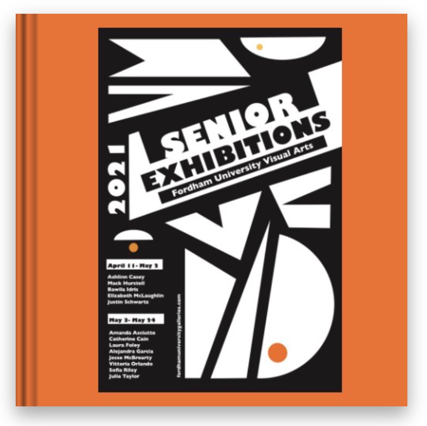
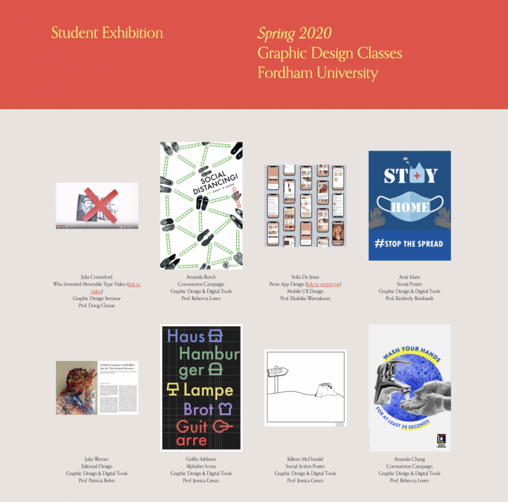
Hot off the press—the 2021 Senior Thesis Exhibitions book by Amanda Asciutto, Catherine Cain, Ashlinn Casey, Laura Foley, Alejandra Garcia, Mack Hurstell, Bawila Idris, Jesse McBrearty, Elizabeth McLaughlin, Vittoria Orlando, Sofia Riley, Justin Schwartz, and Julia Taylor is now available. Edited by Stephan Apicella-Hitchcock with a fantastic cover design by Natalie Norman-Kehe. 142 pages of amazing work by our graduating artists!
2021 Senior Thesis Exhibitions: Small Square, 7×7 in, 18×18 cm, 142 pages is available to preview and purchase here.
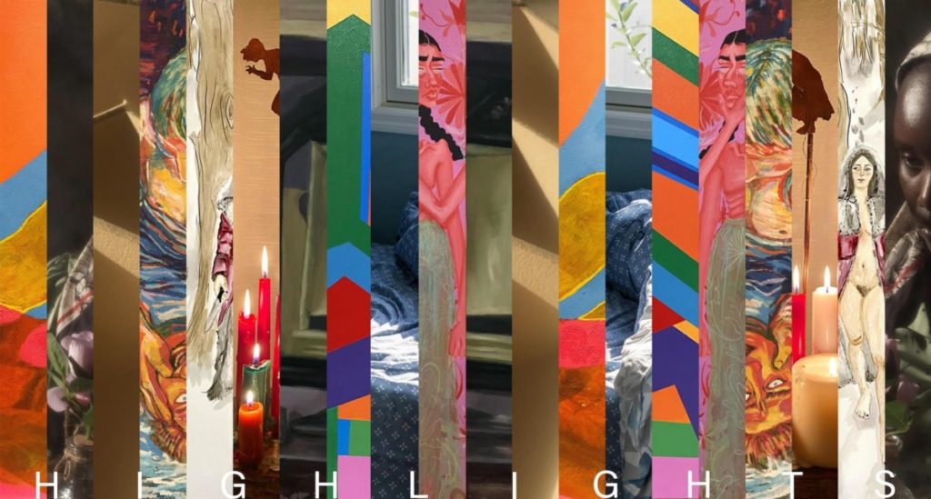
Highlights: Selections from the Senior Seminar in Visual Art ?>
Each fall, Fordham students working on their thesis projects in architecture, graphic design, film & video, painting & drawing, and photography come together for the Senior Seminar to share ideas, give feedback, and develop their unique vision. The semester culminates in the annual Highlights exhibition, featuring a selection of student works across all media.
This year, Amanda Asciutto contributes whimsical watercolor paintings that give traditional fairy tale narratives a feminist twist; Ashlinn Casey offers subtly moody oil paintings of interiors that are clearly lived in but devoid of inhabitants at the moment of depiction; Laura Foley presents a proposal for a sustainably built pavilion inspired by the waves of the Hudson and East River and the hills that once made up the island of Manhattan; and Alejandra Garcia puts forward brightly hued yet often ominous acrylic paintings depicting diosa, a skeletal protagonist who partially reflects Garcia’s experiences growing up as a Mexican American. Mary Hurstell’s quirky paintings of otherworldly bathroom scenes tread the line between the aversion to being seen and the desire to be known and understood; Bawila Idris’s lushly colored videos and photographic portraits navigate the prism of the body, beauty, femininity, race, and identity; and Lizzie McLaughlin’s mixed-medium abstract paintings vibrate with the energy of the psychedelic aesthetic that inspired them. Sophia Riley transforms street scenes from her native San Francisco in semi-abstract acrylic paintings in which bold planes of color teeter and collide; Justin Schwartz creates a tender portrait of his elderly grandmother by photographing the eerily empty suburban house she abruptly left after the pandemic struck; and Julia Taylor plumbs the mysteries of the nineteenth-century Spiritualism movement with multimedia collages and sculptures that suggest peculiar narratives with no clear answers.
These works offer a preview of the virtual solo student exhibitions that will be launched later this spring. To read more about the work, please visit the Fordham Art History Society’s Instagram page Art Ramblings, which is posting reviews by Lilianna Harris, Tess McNamara, Elise Beck, McKenna Meskan, Kassandra Ibrahim, Samantha White, Abigail McClain, Gillian Kwok, and Sarah Hujber.
Curated in collaboration with Casey Ruble, Associate Clinical Professor, Fordham University. For more information, email Professor Ruble.
The Fordham University Galleries Fordham University at Lincoln Center map 113 West 60th Street at Columbus Avenue New York, NY 10023 fordhamuniversitygalleries
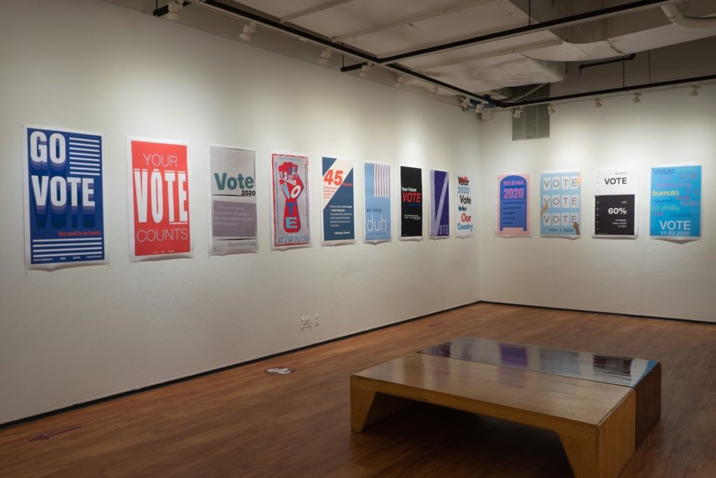
The Department of Visual Arts at Fordham University is pleased to present a new exhibition, Political Engagement Posters, simultaneously in both the Lipani Gallery and the Ildiko Butler Gallery.
Objective: we gave our students in the Graphic Design and Digital Tools class the assignment to design a poster that engages their peers in the voting process. Result: the task’s response was so enthusiastic that the posters have filled the Lipani Gallery walls and necessitated installing additional posters in the Ildiko Butler Gallery atop a preexisting exhibition.
We hope that these inspirational, educational, and provocative posters remind our community of their privilege and civic duty as we approach election day. The eye-catching and informative posters on display will undoubtedly encourage participation in the democratic process and foster an appreciation for clear, effective design.
Currently, the Fordham University Galleries are closed to the public in response to COVID-19. However, the Ildiko Butler Gallery and the Lipani Gallery are still open to Fordham University students, teachers, and staff. Our gallery website will continue to feature a robust selection of offerings from the world of contemporary art and different areas of study offered in the Department of Visual Arts: Architecture, Film/Video, Graphic Design, Painting, and Photography. Stay tuned for our online presentations, discussions, and public dialogues as our gallery website functions as a launching platform for a thoughtful engagement with the issues of our times.
The Department of Visual Arts at Fordham University is pleased to present the second installment of the Adjunct Faculty Spotlight Series with Doug Clouse’s Gravestone Lettering. Over the weeks to come, members from the Department of Visual Arts adjunct faculty will be sharing samplings of their production with the Fordham community.
Currently, the Fordham University Galleries are closed in response to COVID-19. However, our gallery website will continue to feature a robust selection of offerings from the different areas of study offered in the Department of Visual Arts: Architecture, Film/Video, Graphic Design, Painting, and Photography. Stay tuned for increased online presentations, discussions, and public dialogues coming this fall as our gallery website functions as a launching platform for a thoughtful engagement with the issues of our times.
Doug Clouse Gravestone Lettering
The reason I usually give for my interest in gravestones is my love of lettering and type. I’m a graphic designer, so it is hardly surprising that I am fascinated by the “type” (it is almost always lettering) on gravestones. In addition to their lettering, there is much more to justify research in gravestones: their endless variety of sculptural shapes, their texts, and the connections they maintain to individuals long dead. Each memorial is a micro-history of a person, place, and time.
Cemeteries are packed with life and full of meaning, from the contours of the landscape to the style of lettering on the stones. To read cemeteries and gravestones requires sensitivity and humility. One can learn much about living communities by exploring their cemeteries first, such as whether a town is rich or poor (and when; a community’s economic history is displayed in the scale of its memorials), its cultural ambitions, the skill level of its craftsmen, its ethnic origins, and the calamities it endured. Also, a community’s emotional tone can be gauged by the expressiveness of its memorials; their pathos or restraint indicates whether individuals felt at liberty to express themselves or not.
We tend to think of cemeteries as sad places, and interest in them as somewhat morbid. In a cemetery with expressive memorials, the pathos can tug at you, inviting contemplation of one’s insignificance, the fragile nature of physical satisfaction, and our short-lived connections to others. While respecting the expressions of grief (with the humility mentioned earlier), I resist their gravity by maintaining a sturdy conviction or delusion that I will not be joining the silent throng any time soon. Even inscriptions that speak directly to the living and remind us of our inevitable end, like this well-known one:
Remember me as you pass by, As you are now, so once was I, As I am now, so you must be, Prepare for death and follow me.
don’t oppress me, as I am distracted by speculation about why a gravestone client would choose to remind us of death. Were they angry their time was up? Or perhaps reluctant to forgo one last attempt to exert influence in the world?
Lettering and typography have given focus to my research and interest in gravestones. That research has taken place primarily in two locations: Kansas and New York City.
Kansas In 2013 and 2014 I made two trips to Kansas to research and photograph gravestones around Wichita, Kansas. My father’s family is from this area and I had noticed well-lettered gravestones on a family visit years before. The lettering looked similar to the nineteenth-century printing style that was the subject of my 2009 book The Handy Book of Artistic Printing, and I wanted to explore the connection between printed typography and inscriptional lettering.
I was very lucky that some Kansas gravestone makers signed their work because I soon discovered the Wichita firm of Kimmerle & Adams, the designers of many of the stones that appealed to me. This firm stimulated my research by focussing my exploration of many small cemeteries in southeastern Kansas and also broadening it to include the social history of Wichita and Kansas. I wanted to know more about Kimmerle & Adams and how they brought a sophisticated style of lettering to a young, raw place like Kansas in the 1800s. Besides cemeteries, I visited local museums and historical societies to learn more about the area.
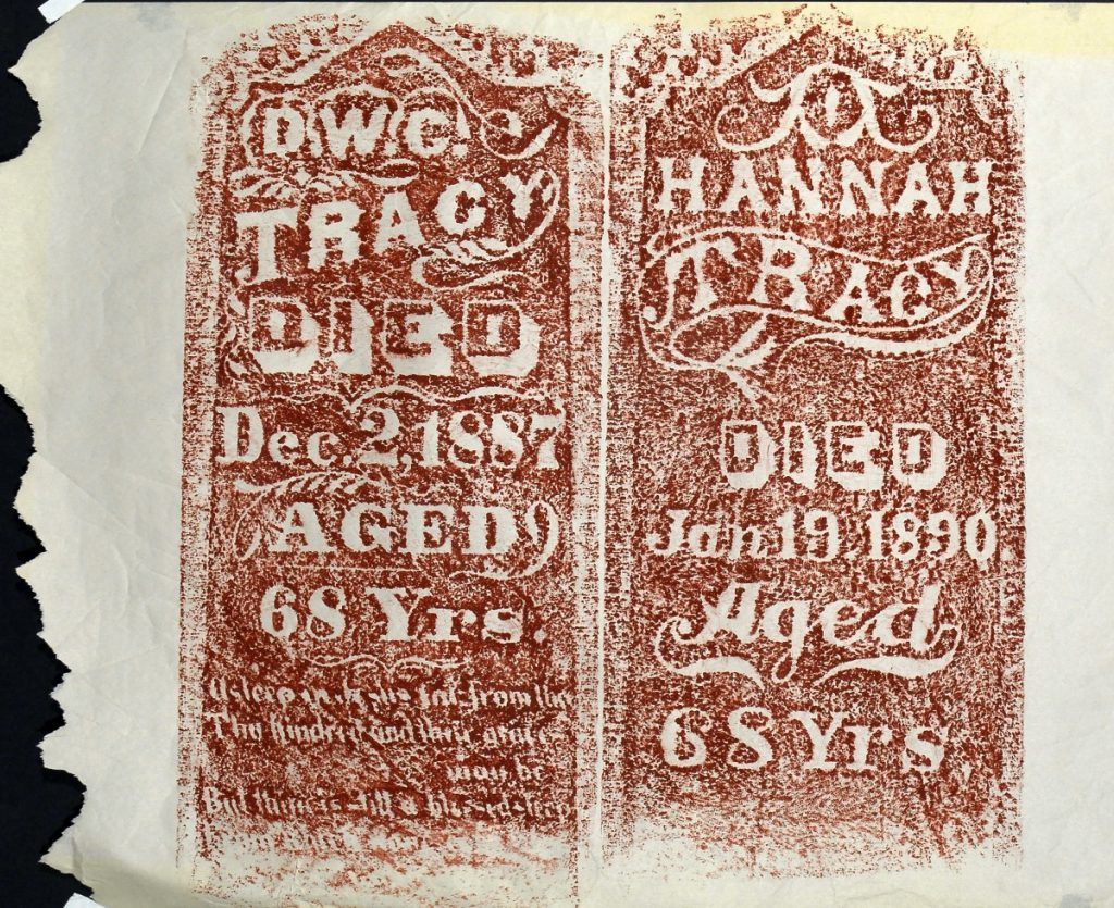
When I encounter fascinating historical design, I’m compelled to make something of or with it. In response to the Kansas gravestones, I took many photos of them and made rubbings of the most visually appealing. The rubbings are basically relief prints that are part historical record, part aesthetic object. They were made quickly with colored wax on gravestone rubbing paper, though when that ran out I used sheets of thin newsprint torn from a roll.
Back home in New York, I compiled my research into an illustrated talk about Kimmerle & Adams that I gave at Cooper Union and also at Hamilton Wood Type & Printing Museum in Wisconsin in 2015. I had high-res photos made of the large rubbings, designed a print of scans of rubbings of the word DIED in many different styles, and made postcards and stickers to give away at my talks.
New York City I live in New York City, where there are millions of graves, marked with memorials as varied as the population. Cemeteries are larger, richer, and more closely administered than in Kansas, so I only recently discovered places to make rubbings of gravestones. Mostly I have explored and photographed the lettering styles at two famous cemeteries, Woodlawn in the Bronx, and Green-Wood in Brooklyn. Because of its location and funding, Green-Wood is much better known than Woodlawn, but Woodlawn boasts a greater variety of lettering styles and a darker, more disheveled landscape. In 2020, I co-hosted a virtual lettering tour of Green-Wood, using photos that I took with my business partner, Angela Voulangas. As I had in Kansas, at Green-Wood I focussed on connections between inscriptional lettering and printing typography.
At Woodlawn, my most exciting discovery related to design has not been the lettering, but rather the unmarked grave of a famous graphic designer, E. McKnight Kauffer. His flat, grassy plot, an obvious gap in a row of gravestones from the 1950s, carries more pathos than any pat inscription, and inspires reflection on the arc of creative careers. Kauffer’s work is celebrated and collected and his home in London is marked with a historical plaque, but he died in poverty and his actual physical remains are nearly forgotten. For several years I have wanted to design and install a memorial for Kauffer, but have not moved beyond getting permission to do so from his descendants in England.
My latest gravestone project in New York City has been to make rubbings of 18th and early 19th-century stones in abandoned cemeteries in Staten Island. Some of the gravestones are disintegrating, so my business partner and I have decided to make rubbings of what we can. Like the Kansas rubbings, these prints are historical records and also images of beautiful things, made in a beautiful way.
The Staten Island gravestone rubbings have inspired rubbings of other historical objects from Staten Island: antique bottle fragments found on the shore. Staten Island has a long industrial history and some of it still washes ashore onto polluted but fascinating beaches. I have been collecting sherds and making rubbings of ones with text on them. These feathery rubbings of broken glass also begin to tell stories of our ancestors’ lives.
The Fordham University Galleries are currently closed in response to COVID-19. In the meantime, please visit our gallery website frequently, as our exhibitions are still underway.
For Doug Clouse/The Graphics Office website: click here For the Visual Arts Department Blog: click here For the Visual Arts Department Website: click here
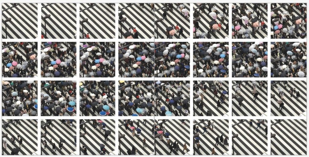
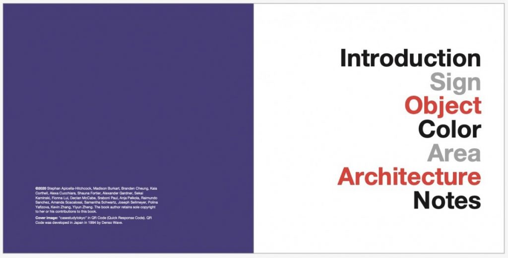
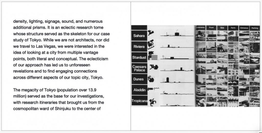
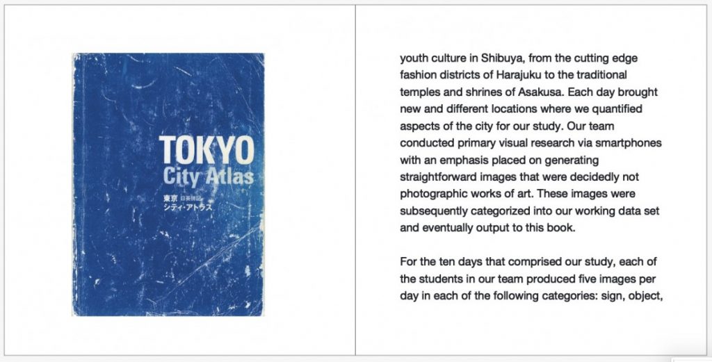
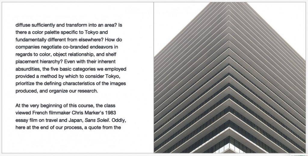
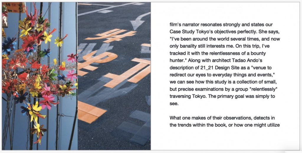
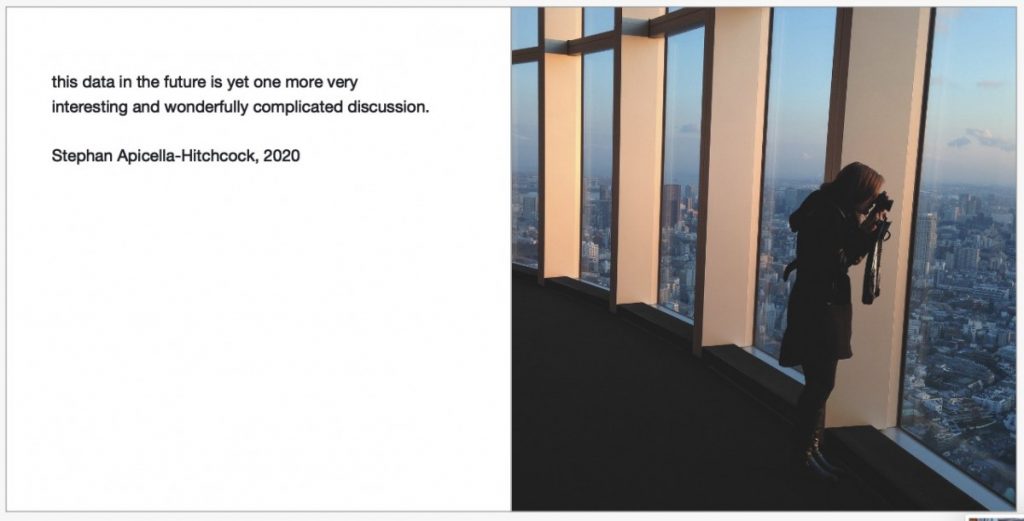
I am pleased to announce to you the completion of a project that is very dear to me. Clocking in at 438 pages with over 4500 images, Case Study Tokyo 2020 by the Gabelli School of Business is finally here!
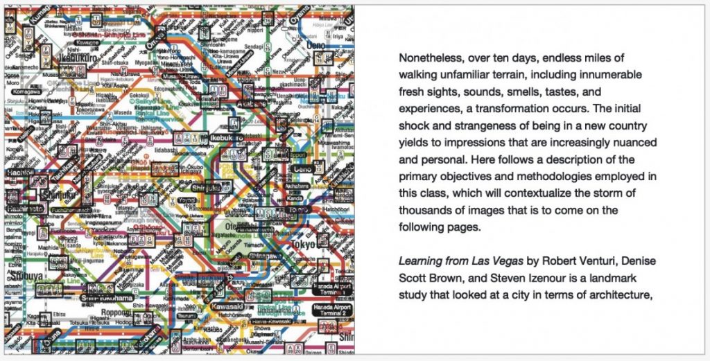
Take one part working methodology from the influential 1972 book, Learning from Las Vegas: The Forgotten Symbolism of Architectural Form, combine with the megacity of Tokyo, add Fordham University Gabelli students, stir for ten days in Japan and what do you get? You get direct acquisition of knowledge through experience with a small team, realized in a hardback research volume focusing on branding, sensory marketing, architecture, design, photography, and urban planning.
Hearty congratulations to the intrepid researchers: Madison Burkart, Branden Cheung, Kaia Corthell, Alexa Cucchiara, Shauna Fortier, Alexander Gardner, Sekai Kaminski, Fionna Lui, Declan McCabe, Sraboni Paul, Anja Pelkola, Raimundo Sanchez, Amanda Scacalossi, Samantha Schwartz, Joseph Sellmeyer, Polina Yafizova, Kevin Zhang, Yiyun Zheng. Preview the entirety of the book HERE. As well, you can order in softcover or two different hardcover formats. Enjoy!